Interaction plots with ggplot2
ggpubr is a fantastic resource for teaching applied biostats because it makes ggplot a bit easier for students. I’m not super familiar with all that ggpubr can do, but I’m not sure it includes a good “interaction plot” function. Maybe I’m wrong. But if I’m not, here is a simple function to create a gg_interaction plot.
The gg_interaction function returns a ggplot of the modeled means and standard errors and not the raw means and standard errors computed from each group independently. The modeled means and errors are computed using the emmeans function from the emmeans package. If a random term is passed, gg_interaction uses the function lmer, from the package lme4, to fit a linear mixed model with the random term as a random intercept.
(requires ggplot2, data.table, and emmeans)
gg_interaction <- function(x, y, random=NULL, data){
# x is a vector of the column labels of categorical variables
# y is the response column
# random is a column name of a blocking factor
# data is a data.frame or data.table
dt <- data.table(data)
fixed_part <- paste(y, "~", paste(x[1], x[2], sep="*"))
if(is.null(random)){ # linear model
lm_formula <- formula(fixed_part)
fit <- lm(lm_formula, data=dt)
}else{ ## linear mixed model
random_part <- paste("(1|", random, ")", sep="")
lmm_formula <- formula(paste(fixed_part, random_part, sep=" + "))
fit <- lmer(lmm_formula, data=dt)
}
fit.emm <- data.table(summary(emmeans(fit, specs=x)))
new_names <- c("f1", "f2")
setnames(fit.emm, old=x, new=new_names)
pd <- position_dodge(.3)
gg <- ggplot(data=fit.emm, aes(x=f1, y=emmean, shape=f2, group=f2)) +
#geom_jitter(position=pd, color='gray', size=2) +
geom_point(color='black', size=4, position=pd) +
geom_errorbar(aes(ymin=(emmean-SE), ymax=(emmean+SE)),
color='black', width=.2, position=pd) +
geom_line(position=pd) +
xlab(x[1]) +
ylab(y) +
theme_bw() +
guides(shape=guide_legend(title=x[2])) +
theme(axis.title=element_text(size = rel(1.5)),
axis.text=element_text(size = rel(1.5)),
legend.title=element_text(size = rel(1.3)),
legend.text=element_text(size = rel(1.3))) +
NULL
return(gg)
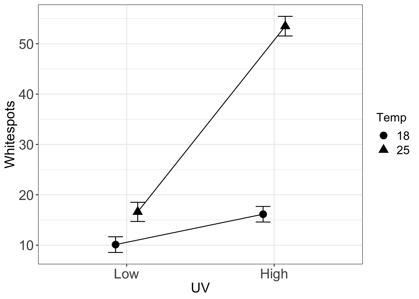
}I use data from a study of the synergistic effect of UVB and temperature on infection intensity (citations below) to show how to use the function. The data are from a 2 x 2 factorial experiment and with a single blocking (random) factor “tank”.
Dryad source: Cramp RL, Reid S, Seebacher F, Franklin CE (2014) Data from: Synergistic interaction between UVB radiation and temperature increases susceptibility to parasitic infection in a fish. Dryad Digital Repository. https://doi.org/10.5061/dryad.74b31
Article Source: Cramp RL, Reid S, Seebacher F, Franklin CE (2014) Synergistic interaction between UVB radiation and temperature increases susceptibility to parasitic infection in a fish. Biology Letters 10(9): 20140449. https://doi.org/10.1098/rsbl.2014.0449
library(ggplot2)
library(readxl)
library(data.table)
library(lme4)
library(emmeans)
data_path <- "../data"
folder <- "Data from Synergistic interaction between UVB radiation and temperature increases susceptibility to parasitic infection in a fish"
filename <- "Cramp et al raw data.xlsx"
file_path <- paste(data_path, folder, filename, sep="/")
fish <- data.table(read_excel(file_path, sheet="Infection Intensity"))
setnames(fish, old=colnames(fish), new=c("UV", "Temp", "Tank", "Whitespots"))
fish[, UV:=factor(UV, c("Low", "High"))]
fish[, Temp:=factor(Temp)]
gg <- gg_interaction(x=c("UV", "Temp"), y="Whitespots", random="Tank", data=fish)
gg