Paired line plots
ggplot scripts to draw figures like those in the Dynamic Ecology post Paired line plots (a.k.a. “reaction norms”) to visualize Likert data
load libraries
library(ggplot2)
library(ggpubr)
library(data.table)
make some fake data
set.seed(3)
n <- 40
self <- rbinom(n, 5, 0.25) + 1
others <- self + rbinom(n, 3, 0.5)
fd <- data.table(id=factor(rep(1:n, 2)),
                 who=factor(rep(c("self", "others"), each=n)),
                 stigma <- c(self, others))
make a plot with ggplot
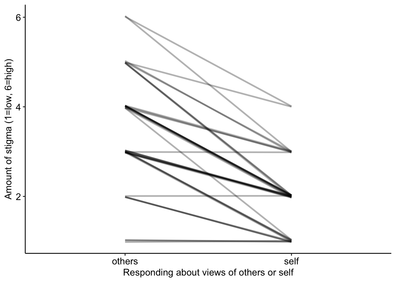
The students are identified by the column “id”. Each students’ two responses (“self” and “others”) are joined by a line using geom_line(), which knows who to join with the “group=id” statement in the aes function in line 1. The alpha setting draws transparent lines (alpha=1 is opaque) so the more lines that are superimposed the darker the line. The lines are slightly jittered in the vertical direction so that overlapping lines appear wider.
jitter_mag <- 0.03
gg <- ggplot(data=fd, aes(x=who, y=stigma, group=id)) +
  geom_line(size=1,
            alpha=0.3,
            position=position_jitter(w=0, h=jitter_mag)) +
  ylab("Amount of stigma (1=low, 6=high)") +
  xlab("Responding about views of others or self") +
  theme_pubr() +
  NULL
gg