R Doodles
Author's picture
Author's picture

R doodles. Some ecology. Some physiology. Much fake data.

Thoughts on R, statistical best practices, and teaching applied statistics to Biology majors.
  • Home
  • Categories
  • Tags
  • Archives
  • About
  • GitHub
  • CrossValidated
  • Google Scholar
  • Research Gate
  • Research/Teaching
  • RSS

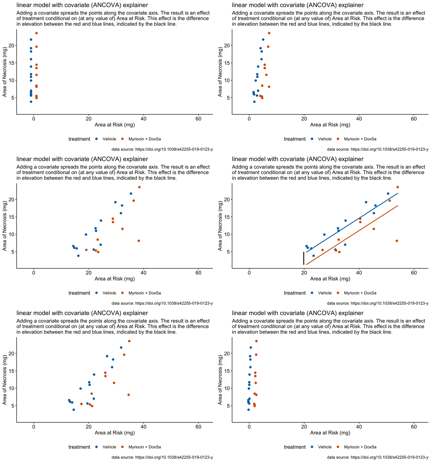
Linear models with a covariate ("ANCOVA")

October 21, 2020 in stats 101

TAGGED IN
ancova categorical X linear model covariates
  • NEXT
  • PREVIOUS
© 2021 Jeffrey A. Walker. All Rights Reserved
  • NEXT
  • PREVIOUS
  • Share on Facebook
  • Share on Twitter
  • Share on Google+
Author's picture

R doodles. Some ecology. Some physiology. Much fake data.

Thoughts on R, statistical best practices, and teaching applied statistics to Biology majors.

Jeff Walker, Professor of Biological Sciences

University of Southern Maine, Portland, Maine, United States
by
no post found

How to make plots with factor levels below the x-axis (bench-biology style)

Dec 12, 2020
The motivation for this post was to create a pipeline for generating publication-ready plots entirely within ggplot and avoid post-generation touch-ups in Illustrator or Inkscape. These scripts are a start. The ideal modification would be turning the chunks into functions with personalized detail so that a research team could quickly and efficiently generate multiple plots. I might try to turn the scripts into a very-general-but-not-ready-for-r-package function for my students. Continue to the whole post

What is an interaction?

Nov 11, 2020
A factorial experiment is one in which there are two or more factor variables (categorical XX) that are crossed, resulting in a group for each combination of the levels of each factor. Factorial experiments are used to estimate the interaction effect between factors. Two factors interact when the effect of one factor depends on the level of the other factors. Interactions are ubiquitous, although sometimes they are small enough to ignore with little to no loss of understanding.

How to estimate synergism or antagonism

Nov 11, 2020
motivating source: Integration of two herbivore-induced plant volatiles results in synergistic effects on plant defense and resistance What is synergism or antagonism? (this post is a follow up to What is an interaction?) In the experiment for Figure 1 of the motivating source article, the researchers were explicitly interested in measuring any synergistic effects of hac and indole on the response. What is a synergistic effect? If hac and indole act independently, then the response should be additive – the HAC+Indole effect should simply be the sum of the independent HAC and Indole effects.

Type 3 ANOVA in R -- an easy way to publish wrong tables

Oct 10, 2020
In R, so-called “Type I sums of squares” are default. With balanced designs, inferential statistics from Type I, II, and III sums of squares are equal. Type III sums of squares are returned using car::Anova instead of base R anova. But to get the correct Type III statistics, you cannot simply specify car:Anova(m1, type = 3). You also have to set the contrasts in the model matrix to contr.sum in your linear model fit.

Linear models with a covariate ("ANCOVA")

Oct 10, 2020

Normal Q-Q plots - what is the robust line and should we prefer it?

Oct 10, 2020
Warning - This is a long, exploratory post on Q-Q plots motivated by the specific data set analyzed below and the code follows my stream of thinking this through. I have not gone back through to economize length. So yeh, some repeated code I’ve turned into functions and other repeated code is repeated. This post is not about how to interpret a Q-Q plot but about which Q-Q plot? to interpret.

ANCOVA when the covariate is a mediator affected by treatment

Jul 7, 2020
This is fake data that simulates an experiment to measure effect of treatment on fat weight in mice. The treatment is “diet” with two levels: “control” (blue dots) and “treated” (gold dots). Diet has a large effect on total body weight. The simulated data are in the plot above - these look very much like the real data. The question is, what are problems with using an “ancova” linear model to estimate the direct effect of treatment on fat weight?

Bootstrap confidence intervals when sample size is really small

Jun 6, 2020
TL;DR A sample table from the full results for data that look like this Table 1: Coverage of 95% bca CIs. parameter n=5 n=10 n=20 n=40 n=80 means Control 81.4 87.6 92.2 93.0 93.6 b4GalT1-/- 81.3 90.2 90.8 93.0 93.8 difference in means diff 83.

What is the consequence of normalizing by each case in the control?

May 5, 2020
Motivator: Novel metabolic role for BDNF in pancreatic β-cell insulin secretion I’ll finish this some day… knitr::opts_chunk$set(echo = TRUE, message=FALSE) library(tidyverse) library(data.table) library(mvtnorm) library(lmerTest) normal response niter <- 2000 n <- 9 treatment_levels <- c("cn", "high", "high_bdnf") insulin <- data.table(treatment = rep(treatment_levels, each=n)) X <- model.matrix(~ treatment, data=insulin) beta <- c(0,0,0) # no effects # the three responses are taken from the same cluster of cells and so have expected # correlation rho.

Melting a list of columns

Apr 4, 2020
An answer to this tweet “Are there any #Rstats tidy expeRts who’d be interested in improving the efficiency of this code that gathers multiple variables from wide to long? This works but it’s not pretty. There must be a prettier way…" Wide data frame has three time points where participants answer two questions on two topics. create data from original code #Simmed data Time1.Topic1.Question1 <- rnorm(500) data <- data.frame(Time1.Topic1.Question1) data$Time1.TOpic1.Question2 <- rnorm(500) data$Time1.

47 posts found